
Monday, 25 November 2013
Friday, 15 November 2013


Wednesday, 13 November 2013
Magazine Cover examples

I chose to use these images as examples because they have similar house styles to me. They all have either a plain or black and white image as their main image with a bright contrasting color in their main text or Masthead.
Monday, 11 November 2013


Friday, 8 November 2013

House style - Colours.

I have chosen these for colors for my magazine because i think they contrast each other well. I have also chosen them because most of my photography within the magazine will be black and white so these colors i think will compliment well with this. I have chosen to use pastels because i think they are light and simple which coincides with my chosen music genre. But i also have the darker Maroon and Crimson to contradict which overall suits with my house style of Individuality.

Initial draft of name designs.

I chose these three draft ideas initially because i thought they were all very bold but different. The first one is very large and will stand out on the cover of my magazine. It has no color so therefore will stand out against my colorful background. In the end i didn't choose it because i thought it did not conform to my style so it wasn't as simplistic as i would like it. The last of the three i liked because i thought it was simple and original . I liked the way that you had to interpret what the word was which already has the reader thinking of what the magazine is going to be like. But overall i didn't like because although i'm looking for simple it still had to stand out on my page and i felt like this one wouldn't. In the end i chose the middle option because it was simple yet bold. Plain but it still had color, and it didn't show the exact word unless you took time to look at it. My magazine is hoping to already be successful so the name "wire" shouldn't need to be displayed directly such as magazines as NME for example. Overall i think it should be very effective.
Friday, 25 October 2013

Wednesday, 23 October 2013

Monday, 30 September 2013


Saturday, 28 September 2013

Monday, 23 September 2013


Sunday, 15 September 2013
Review for my coursework
Photography:
I have discovered i will probably need to spend more time on my photos. Not only will i have to take them with a better camera i will need to take more time in editing them and making them the right size and focus. This is an important issue because the photographs are one of the main aspects of the page that draws the reader in and gets them intrigued with the page which is why it is vital that when i do my main coursework i get them up to standard.
Text/font choice:
At the moment i am pretty happy with my text choice although i feel i could make it stand out more by using brighter and more bold colours because at the moment it doesnt really do its job of standing out to the readers. It needs to be more out there to really catch the readers eye.
House Style
Colour Scheme
For the colour scheme of my problem page I chose pastel pink and blue and light yellow. This is because I think these colours are very neutral and as my target audience is will be male and female, these colours would therefore be relevant to my target audience. I chose to focus on these colours because although they are quite soft they are also bright enough to capture the readers eye.
Fonts
I have chosen two different main fonts for my problem page. I have chosen Courier because I like how its easy to read and simple, but its still a bit original and formal. I think that it would be more relevant to my target audience, who are teenage sixth form students, if the font is slightly interesting and ‘individual’. I have also chosen Helvetica because I think this font is bold and out there. However my slogan and mast head will be in there own fonts and colours to make them stand out.
Magazine Planning
Name ideas for my problem page;
Dear Sian
Dear Downs
Ask anything
Ask me about it
Tell me about it
Tell me about it...
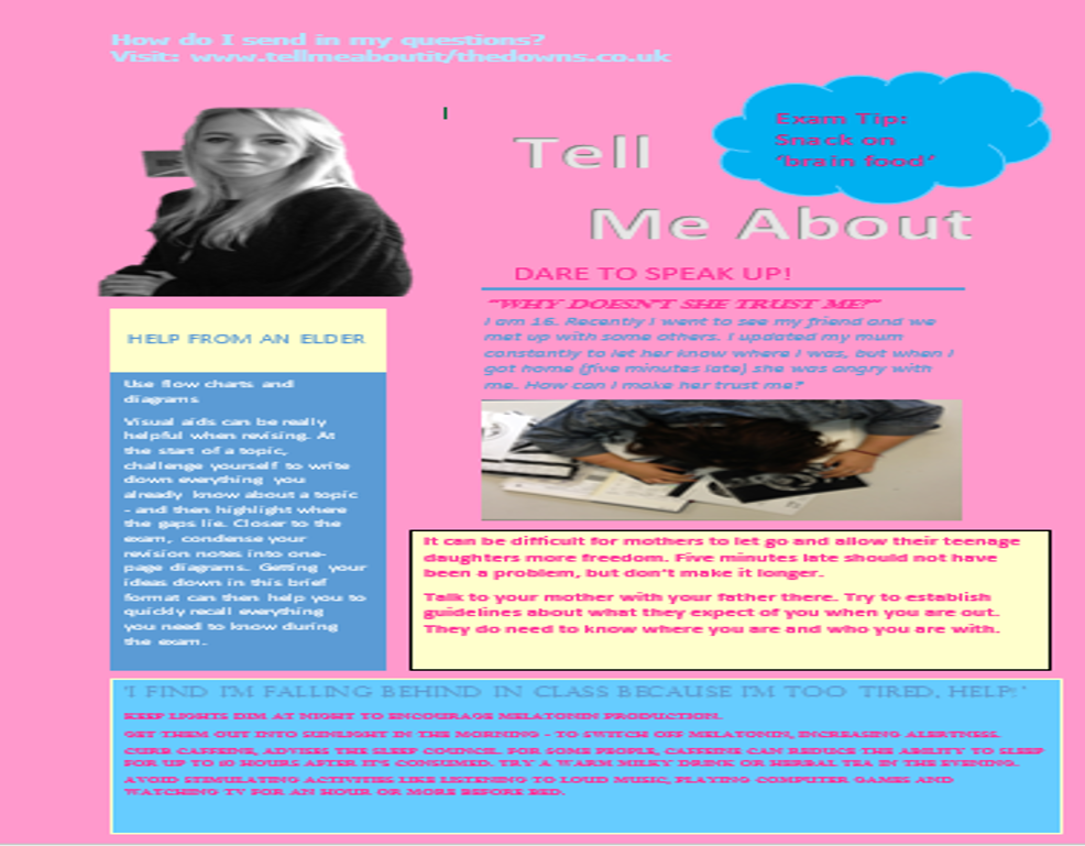
I have chosen the name 'Tell me about it' as it gives the impression the Agony Aunt has heard it all before. 'Tell me about it' will also allow the reader to know what the page will be including, making it clear that it is a problem page. This title also gives off the impression that the page is open for people to tell anything. Furthermore the title gives off a personal feel to the reader this is because it may feel their questions are being answered by someone who knows all about it as if they are being answered as a friend or a fellow student.
Slogan ideas for my problem page;
speak to us
share your problem
dare to tell
Dare to speak up
Dare to speak up
I chose 'Dare to speak up' for my problem page slogan because it is simple and easy to feel comfortable with but it also says exactly what the page is going to contain. The slogan having quite a bold placement will give the point straight to the reader. It will also encourage people to do exactly what is says and speak up.
Dear Sian
Dear Downs
Ask anything
Ask me about it
Tell me about it
Tell me about it...
I have chosen the name 'Tell me about it' as it gives the impression the Agony Aunt has heard it all before. 'Tell me about it' will also allow the reader to know what the page will be including, making it clear that it is a problem page. This title also gives off the impression that the page is open for people to tell anything. Furthermore the title gives off a personal feel to the reader this is because it may feel their questions are being answered by someone who knows all about it as if they are being answered as a friend or a fellow student.
Slogan ideas for my problem page;
speak to us
share your problem
dare to tell
Dare to speak up
Dare to speak up
I chose 'Dare to speak up' for my problem page slogan because it is simple and easy to feel comfortable with but it also says exactly what the page is going to contain. The slogan having quite a bold placement will give the point straight to the reader. It will also encourage people to do exactly what is says and speak up.
Friday, 13 September 2013

Monday, 9 September 2013
Readership profile
Who is my target audience?Age- The age of my target audience I think will be from the ages of 16 upwards I think any younger than that they will either not be reading the magazine or take any interest in a problem page. I think the main age is 30-50 because this is the main age of parenthood and most people writing in it’s either because of their marriage or children.
Gender- I think these pages are mostly targeted at women because of the style of the page. The colours used are mostly pinks and the style is overall girly. Also when reading more into the questions asked I figured out that they are mostly questions about husbands or children.
Review of comventions and style features of problem pages.
ProblemPages:
This is my review on the three problem pages so that i can understand how to create mine better.
- MAST HEAD- The mast head of most these problem pages is the names of the 'Agony Aunt' answering the questions written in by others. So they will most likely be Ask Annie. They might also be something to do with the main question that has been written in. These are usually written in large bright font so as they stand out to the viewing audience....for example:

- STRAPLINE- The main strapline on an agony aunt page is usually there 'slogan' a way to catch the readers eye. Something that will make the audience want to right in and feel as if they can trust whoever they are writing to. It will usually be something like:

- MAIN IMAGE- The main image on most problem pages is a picture of the Agony Aunt. There will be other images but this will mostly be the main image. It isusually positioned at the top and is quite large. It shows the agony aunt looking friendly and comforting.

- OTHER IMPORTANT- These pages will also have;
different colour writing to differentiate the question and answer
the bigger the question the bigger the text and the brighter the colours surrounding it
they often use capital letters at the begining of the question and answer (dropcaps).
they layout is very simple on each, they use columns boxes and borders.
- They are usually written in pinkish girly colours. Usually bright and out there.
Subscribe to:
Comments (Atom)